Moments Over Perfection
I was recently approached by someone in need of a logo and branding for their new travel blog. The name of the blog is Moments Over Perfection, which lends to the idea of embracing the unexpected interruptions that don’t go according to plan as those moments can lead to the most cherished memories.
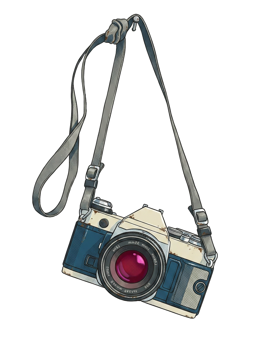
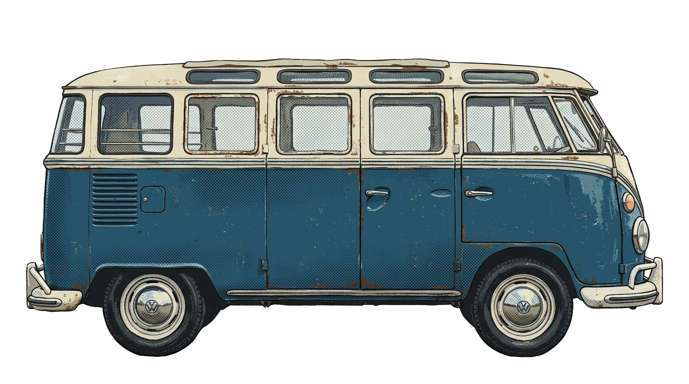
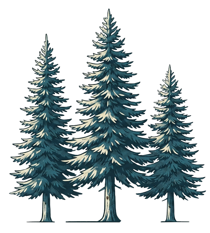
There were a few visual ideas that were predetermined and given to me to bring to life, which were - a VW Bus, a classic bicycle with a basket of Oregon Wild Flowers, a camera, and trees or northwest like scenery.
I made 3 separate logos that were very different expressions that all contained the same required elements.
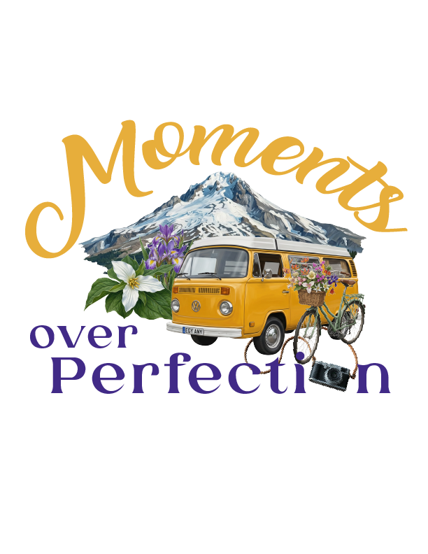
Starting with logos that were not my client’s final choice –
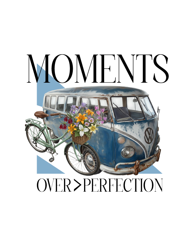
The above logo is probably my favorite. It reminds me of an elevated magazine aesthetic. It has the VW Bus and a bicycle with Oregon wild flowers with a seraph font and some abstract shapes in the background to bring structure to the logo.
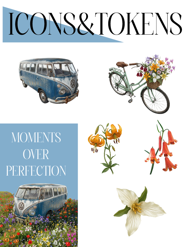
I then separated some of the items and flowers that can be used as brand marks and accents when designing a blog post or website.
From all of these elements, I chose a color palette, and to be honest, I really love this color palette. I rarely choose so many primary colors, but I slightly muted them which helps them blend together so well. Every primary goes well with every other color. I also included a light and dark blue to have some contrasting options.
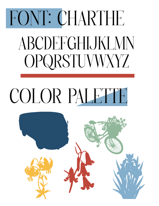
The next logo was based off of an idea that my wife drew up and I wanted to see if I could bring it to life. This van was not quite what the client had requested, but I wanted to show a different color as well as a Bus in pristine condition as opposed to the older, worn and rust VW Bus in the previous logo example.
This one draws from the gold color of the van which pairs nicely with the purple of the wild iris. I also included the white of the Western Trillium and a mountain modeled in the aesthetic of Mt. Hood in Oregon.
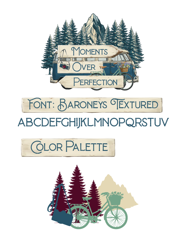
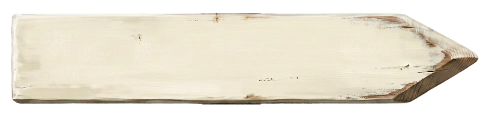
The logo and branding that the client ended up choosing was actually my first envisioning - a side profile van with 3 slats in the image of a trail sign. The arrows, if you notice, are pointed with intention - the arrow congruent with the direction of the van has the word “moments” inscribed while the arrow pointing behind contains the word “perfection”.
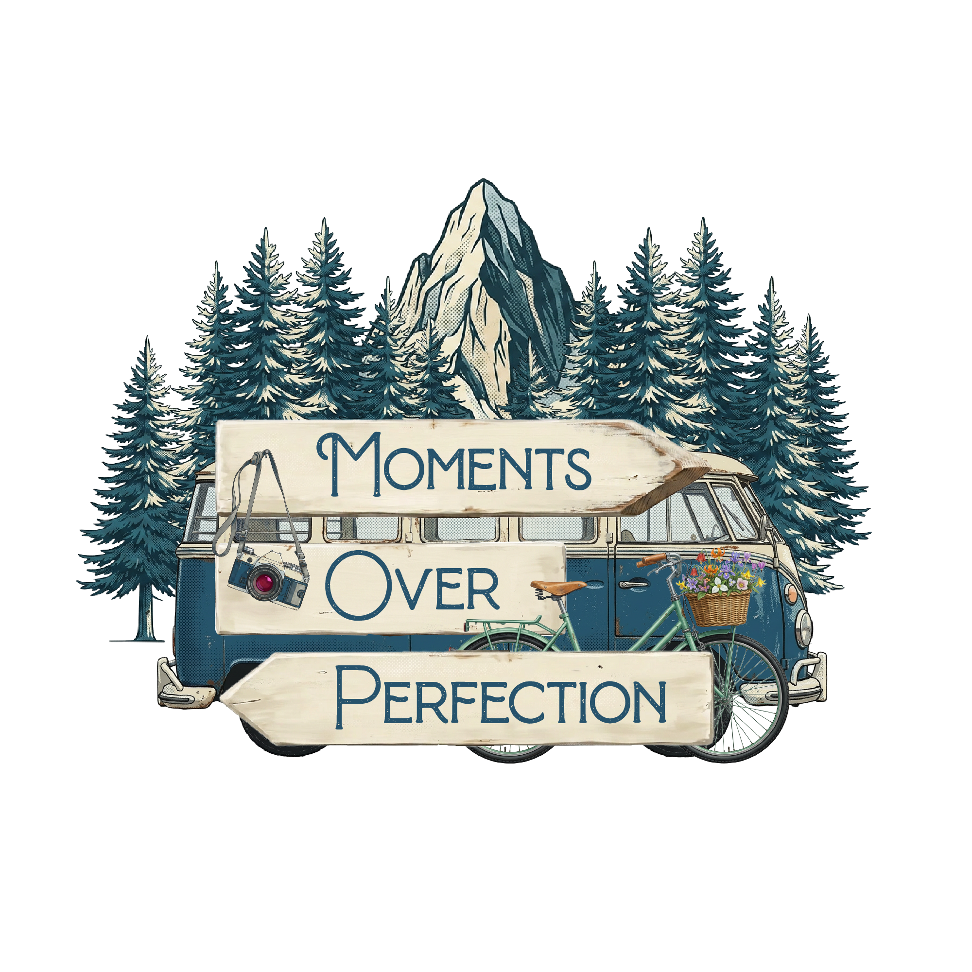
This rendition includes all of the requested elements, but included both trees and mountain, which I think was what ultimately won over my client.
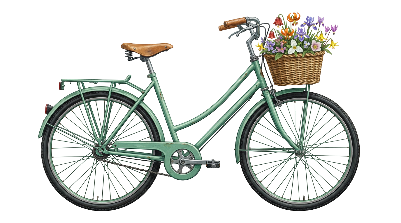

Note that the basket on the bicycle includes a bouquet of Oregon wild flowers that were specifically requested: Red Bells, Oregon Lily, Wild Iris, Western Trillium, Fawn Lily, Cats Ear, Henderson Shooting Flower