As I was scrolling Facebook one day I saw a friend of mine posting a logo he created for his business and he needed help turning it into a vector file to be used with a laser etching software. I told him that I could probably figure out how to do that for him.
Through our talks I also decided to create my interpretation of the logo just to show him what’s possible and included a branding package with fonts, color palette and some icons that can be used in various applications.
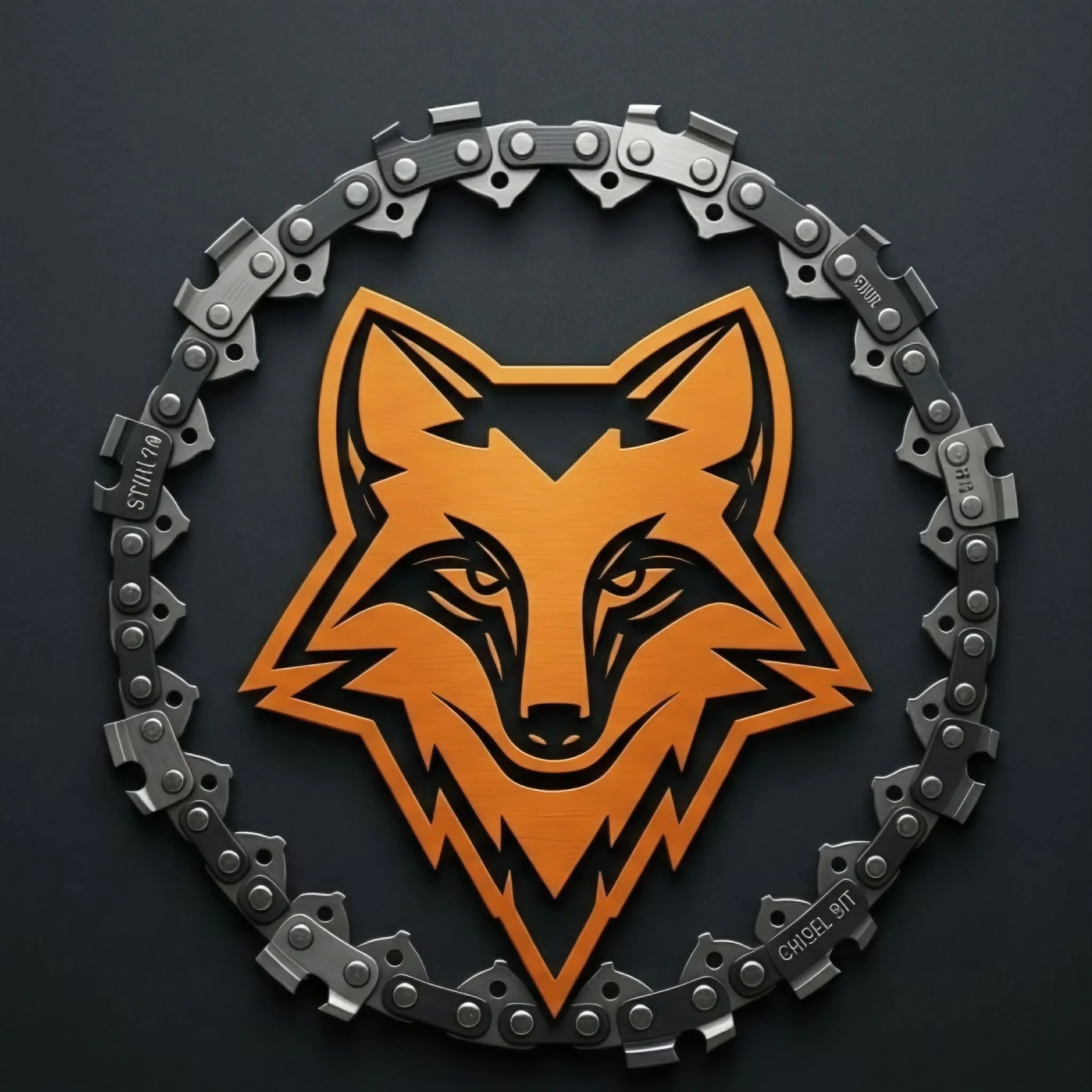
The name of the company is Foxhound Northwest and they specialize in custom cosmetics for chainsaw shrouds and other plastic covers. Naturally he created a logo with an abstract fox head within a circular chain akin to that which a chainsaw uses to cut.
I like the basic form, but noticed the most glaring issue was that the name of his company was not featured in his original logo and I needed to find a way to highlight that.
I originally thought that I would put a chainsaw shroud behind the name to give contrast to the lettering, which makes the name easier to read. The shroud would also have the objective visual tie-in, however, I found that shrouds did not work visually as they are not symmetrical and don’t provide enough empty space for the letters. I decided to create some kind of platform that looked like a shaped piece of plastic that you would find on a chainsaw or in various motorsport equipment.
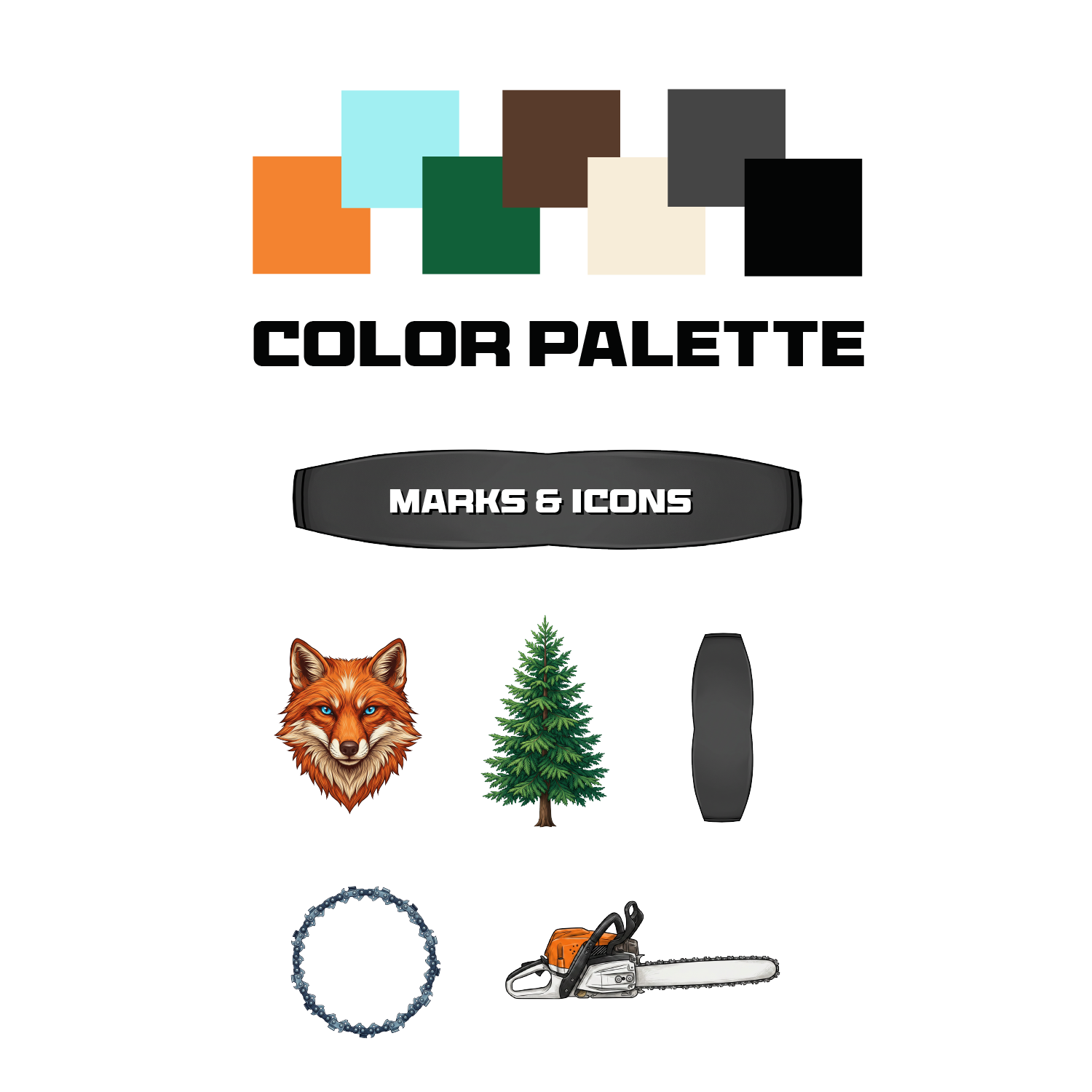
I also felt the need to fill the space behind the fox head and nothing really says “northwest” like a lush green tree. The company is based in Washington State and the state tree is the Western Hemlock. I also tried a Douglas Fir, but the Western Hemlock ended up working the best visually so that’s what I chose.
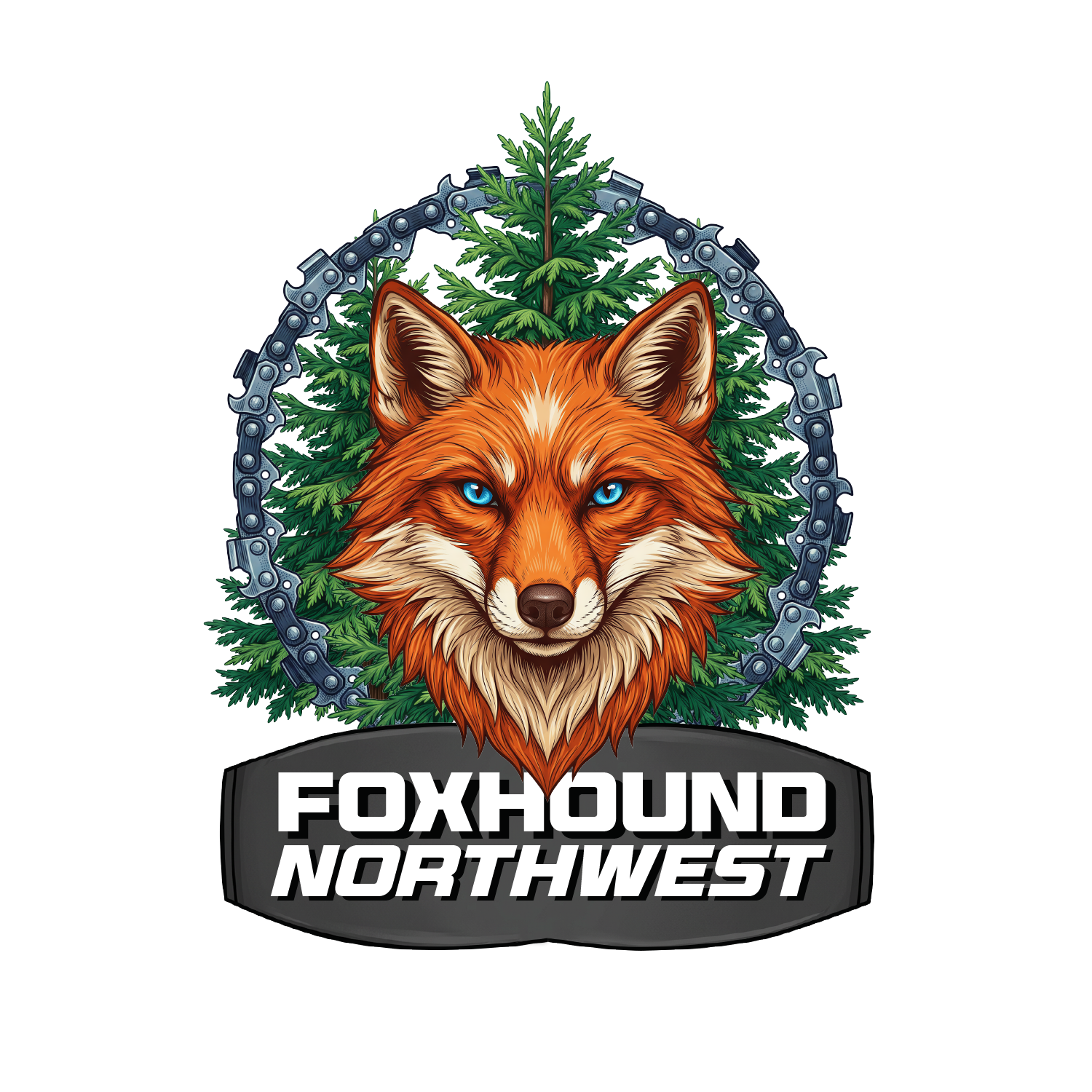
The client enjoyed the detail of the trees going both behind and in front of the chain giving it a dimensional feel.
From this logo I pulled a bold color palette that is a combination of typical northwest outdoor brands and the vibrancy of motorsports vehicles.