Arise Transformation Center is a sister entity of the Bastrop Prayer & Healing Rooms.
I was tasked with creating a logo for the newly founded LLC. whose name was derived from the following Bible verse:
"Arise, shine; for your light has come, And the glory of the Lord has risen upon you."
- Isaiah 60:1
The concept of the name “Arise” has two parts - Arise, which in Hebrew is the feminine form, meaning to get up as though you have the strength and ability to do something effectively and “shine”, acting as a light.
The meaning of the word “Arise” told me two things, the logo needed to be feminine, yet strong. I used this understanding to inform the font choice. I settled with a strong serif font that had a bit of flourish expressed in the “R”.
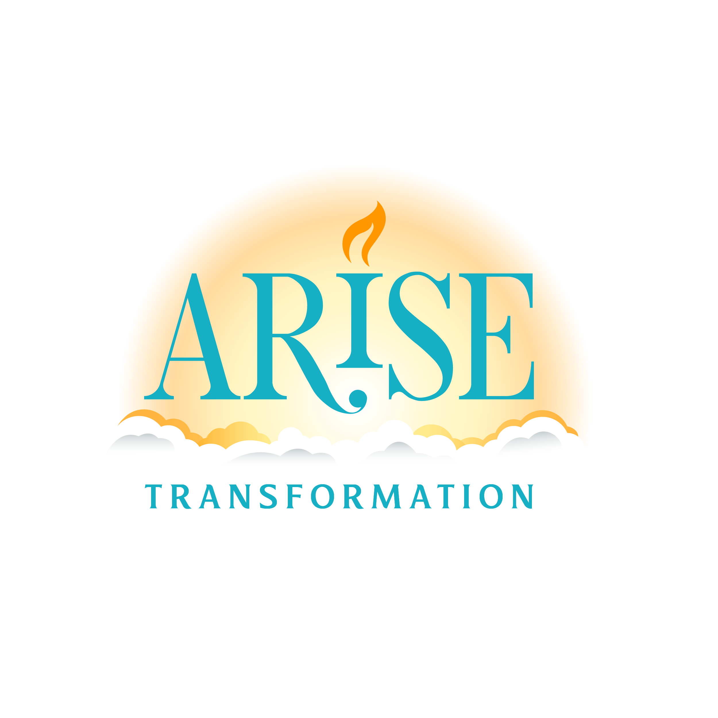
After playing with a few concepts of the sun rising from mountains, I realized there was something specific about rising above clouds that was important. Lauren Hansell, founder of the Bastrop Prayer and Healing Rooms and Arise Transformation, has written a manual for inner healing and deliverance. In this manual, she describes a process she calls “going vertical” and even uses the imagery of an aeroplane rising above the clouds, proving to be consistent with her ethos.
After playing with a few concepts of the sun rising from mountains, I realized there was something specific about rising above clouds that was important. Lauren Hansell, founder of the Bastrop Prayer and Healing Rooms and Arise Transformation, has written a manual for inner healing and deliverance. In this manual, she describes a process she calls “going vertical” and even uses the imagery of an airplane rising above the clouds, proving to be consistent with her ethos.
I shortened the “I”, which, because of the serif, created a shape that acted as a pedestal to emphasize a light source. Initially, I began with using a star as the light source to couple with the theme of being in the sky and shining.
However, I had the idea of trying a flame and it was more visually appealing. The symbol of a single flame has been used for centuries in Christian-themed art to represent the scene at Pentecost in the book of Acts. The “I” with a flame reminds me of the brazen altar that was used for burnt offerings in the tabernacle found in Exodus.

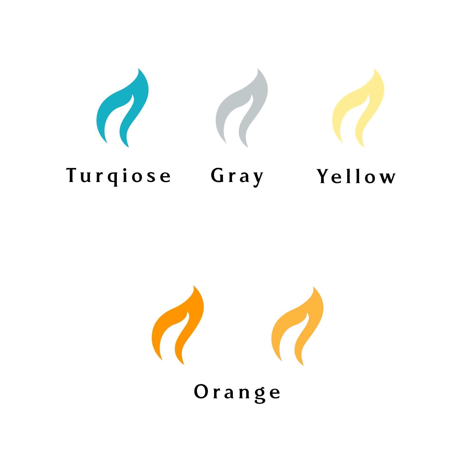
After deciding on a basic one-color black design that included a simple secondary font that seemed to work well, I designed a color palette. Having been to Lauren’s house, I noticed it was covered in turquoise-colored items and knew that it needed to be the primary color for the Arise brand identity.
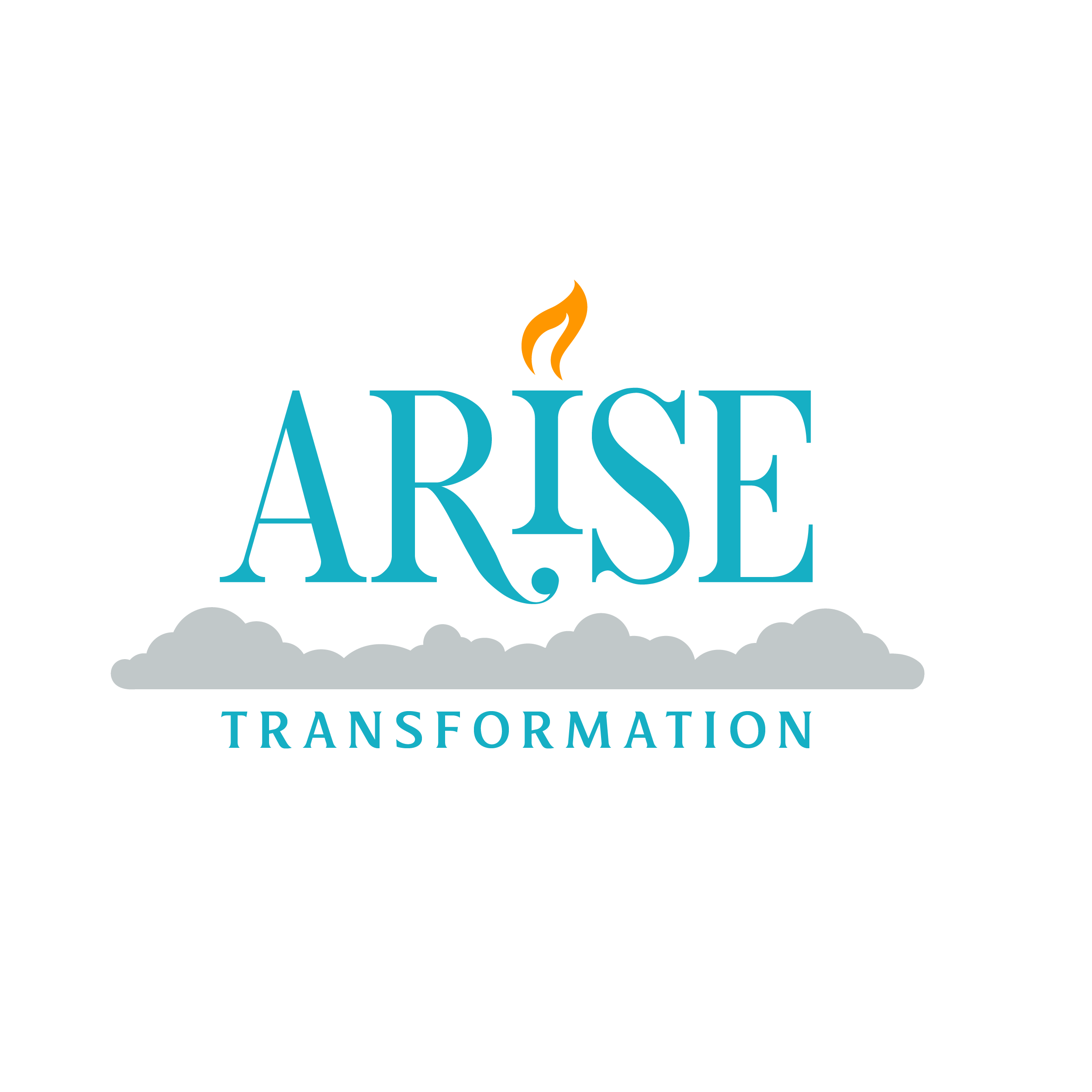
After putting together the basic structure of the logo with an easy-to-read secondary font, I decided to present the logo to Lauren. She loved it, but wanted to see more shine and fluffier clouds.